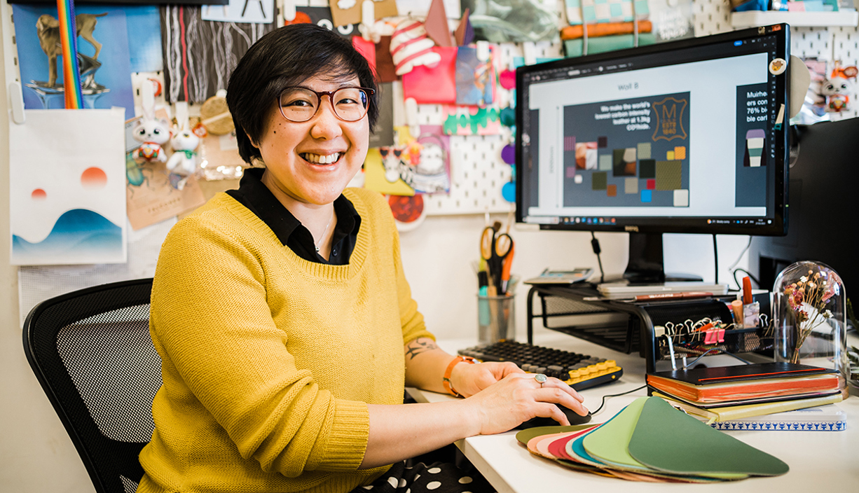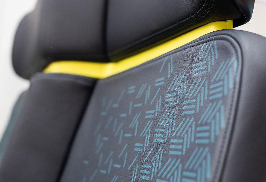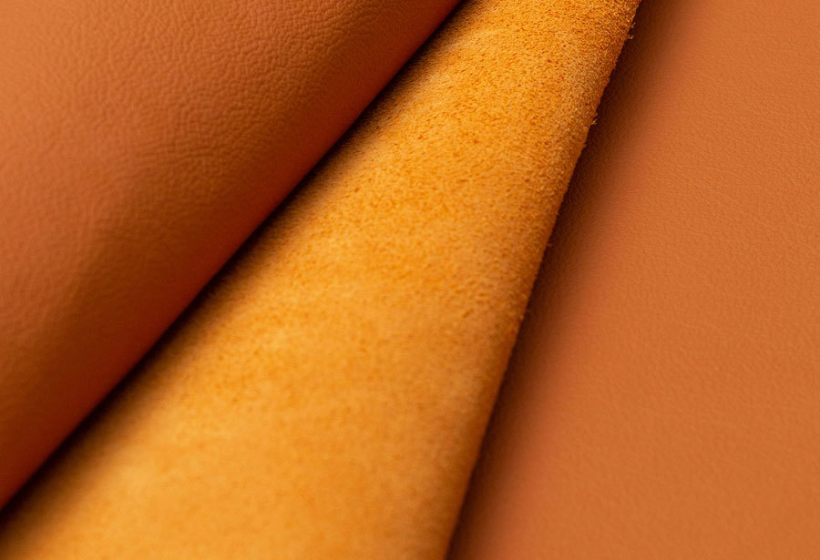
Our Natural Performance range is growing! Adding to our beloved existing products, we’re unveiling three new colours: Aubergine, Kumquat and Nori Green. Our Design Manager, Debra Choong (She/Her) and Junior Designer, Jamie O’Donnell (He/Him), have shared their insights on how they found inspiration for the new colours.
Colour Inspiration
The inspiration behind Kumquat is a bright, bold orange inspired by the vibrant citrus fruit that is Kumquat. This orange brings a zesty vibe to the collection. The Nori Green is a deep green inspired by wild seaweed, and this colouring brings an earthy tone to the collection. The Aubergine is inspired by the deep purple vegetable, and this brings a royal energy to the collection. Looking at the existing collection, we thought it was time for a bit of a change-up; that’s why you’ll see the newly edited version of most of its existing colours. We felt they all still had a place in the collection, along with the additions of the three new colours.

In particular, the Kumquat is almost a direct replacement for our old Jaffa, which was a very bright and saturated orange. The Kumquat is a bit more subdued, in line with how the trends were going. It's a very warm, rounded orange. There was still a place for orange in the collection, but just maybe not something as bright and in your face as the Jaffa again, just with the way the trends colours were going and with the Peach Fuzz being the trend colour from last year, it actually ties in very nicely with that.
With the Nori Green and Aubergine, Muirhead has always had a really good selection of dark blues and blacks, which are consistent with our customers. However, it was lacking in the dark greens, and we had the opening for a dark purple. We have previously had more royal purples, but with the Aubergine, we felt it fit this niche, a really dark, deep purple. The Nori Green and the Aubergine are almost black with hints of green and purple in their own rights. So again, it works very well and fits in with more natural food-based influences. Particularly in our colour selection, these two were missing from our previous collections. As designers, we’ve seen it in many global design trends and various shows, especially over the last year or so. Specifically in automotive design, furniture and interiors, these darker off-blacks are a bit more consistent and tie in very well with the needs of our customers going forward and with this collection, so hopefully, it fills that hole.
There have been many cultural and natural influences behind choosing each of these new colours. The Kumquat is from the continuing health and wellness trends that have developed over the last 10 years or so because it's such a rounded, warm colour. It works particularly well in interiors as it brings a bit of lightness but also grounds it towards natural citrus fruits. Whereas, the Nori Green and the Aubergine have much more depth to them. So, if you're looking for something a bit more impactful and dynamic, these two colours fit that really well. They are a good alternative to the navies or the blacks that many customers would probably go for. There has been a lot of greens in interiors, especially, with this trend of bringing the outdoors internally. Our collections already cover many of the sage and the more leafy greens. So, the Nori is a continuation of that to tie out the spectrum of the greens because we never really had a dark green like this before.
There’s a lot of different shades of the greens and the purples, so, these particular selections were the best compromise. Instead of doing a whole selection of purples and greens, the dark versions of these are fairly well known and in line with the trends that we've seen and will continue to see going forward in the next few years or so.
Design Process and Colour Science
Managing to get back out into real-life shows, compared to when we were stuck to seeing everything digitally or online during the COVID years, has been much more ideal for the process of translating inspiration into the final colour palette. Getting back out to the shows, we really noticed the impact of a lot of these different colours. At the research shows, we take notes on groups of colours that we see within many evolving trends. It can be a bit subjective, how we take what we've seen as inspiration and translate it into what we produce in our final products. However, knowing what our customers have used in the past and what they might use in the future. The science part would be taking what we know has been used in recent years and what our customers have been crying out for and then also filling in some of the gaps which haven't been covered before.
One thing we’ve been lucky with is we haven’t had many challenges during the development of selecting these specific colours. In particular, for the selection of the Kumquat, we felt there was a need to relook at the orange selection because it’s such a bold colour it’s quite difficult to guess, as that’s really what we’re doing, and to distil that into one individual colour.
With our selection, we've covered the lighter colours, like the whites, beiges, tans, and sandy colours really well. We have many more natural tones which will always be relevant in our collections. However, there is always space for something a bit bolder and more challenging. The challenge for the Kumquat was we had a range of different oranges but nothing as bright as the Jaffa, so it was really deciding and distilling that down into the one orange that would replace it. When we were trying to condense the collection, we found that we were looking at what sells the best, and it was like all the dark colours, but we found putting all those together made the collection look a bit ‘muddy’. So, it's actually really helpful for us to have this lovely bright colour that isn't too bright, but just the right balance.

We picked a Pantone that we felt most closely matched our design intent, and the Colour team did their colour-matching magic to match the new colours. We see a small sample before it reaches the production stage, and our Colour team are just really good at what they do, so they managed to match the original Pantones. They didn't imply that there were any sort of difficulties, which was great because sometimes some colours are quite difficult in terms of coverage and range. But again, we didn't get any sense that there was any difficulty. Maybe that's just a testament to how good they are!
Market and Customer Insights
We do a lot of travelling around design shows and exhibitions. With our customer requests that we've been getting globally, especially our Asian customers, they're looking for something a bit different from the usual blues and navies. They like dark greens or dark purples and even the oranges. We're trying to appeal to a bigger global market as a brand. It's not just Europeans or Americans.
Tying in with a lot of the general design research that we've done, a lot of the inspiration has come from what we've seen directly in person from many of these shows. We attend furniture shows, so within the last couple of years, there have been Stockholm Textile Shows and Cologne and Frankfurt, as well as seeing the most recent automotive concept designs and adding a lot of fashion and materials available during Milan Design Week. We take a lot of inspiration from various industries and the specific market; the direct market research we discuss individually with our customers.
We're hoping that this collection will still cater to the needs that we've seen our customers requiring in the past and our previous collections. Hopefully, because these new colours are filling in some of the missing gaps, we’ll continue to meet the needs of our customers, which will be beneficial in the selection process in the future.
Global Influence
The Aubergine was one we didn't necessarily see in person. It has only been more recently and towards the end of the creation of the collection that it started popping up everywhere, maybe more digitally and specifically in luxury car interiors and design interiors.
When you see an abundance of certain colours, like we have felt with the Aubergine, and while we were looking through our previous collections, we thought, ‘oh, why don't we provide something like that?’ and maybe it's just not been noted in the past, but, interestingly, there's been a lot of it popping up now.

There’s been a lot of Barbie pink everywhere recently, so people are starting to look for something a bit more subdued. On those lines, pinks and purples always go through a cyclical phase, but this dark purple would definitely fill a gap with a more neutral vibe, and it's more accessible and timeless than, say, the Barbie pink. With the darker colours, we’re hoping they're a bit more natural so they will appeal to a range of different diverse cultural customers.
Although it can be difficult to say about upcoming trends, we are influenced by previous experiences of colours used and requested in the past. We take all of that and tie it into the current selection.
As we've chosen some quite dark colours, these are likely to have a positive uptake and, as we’ve said, fill in the gap. Where we can go from here is we might have more potential requests for something on the lighter end of the spectrum, but we have already catered to a lot of that with the rest of the collection, so I don't think we're missing out.
We touched upon where some of the influences have come from. They are similar to the natural ingredients of a recipe, each of which can influence our colour palette. There will always be the theme of natural inspiration that will never go away. Luckily, we've got a large palette to choose from. Whilst this new colour collection is coming out for our ‘off the shelf’ products, we're also working on the next collection, which, again, we'll tie in more of a naturally inspired palette in the future. The actual leather will be more natural as well. As part of our continual product development, we’ll work closely with our Technical and Innovation teams, whom we’re always very heavily influenced by and want to make the most sustainable product possible.
On this note, we are currently working on the next innovations regarding leather performance and sustainable manufacturing processes. Taking all these different techniques and tying them into our new collection, we feel that the colour palette will also help reflect the science and technology that has gone into making the new collection. So, watch this space!
Latest Insights


